

Two simple valuation metrics are often used to assess the relative richness (or cheapness) of US equity markets: forward price-earnings (PE) ratio, and stock market value to GDP.
The S&P 500 currently trades on a forward P/E of 19.2, against a five-year average of 19.8 and a ten-year average of 19.0. Judging by historical standards, this would suggest the value of equity markets is fair. Yet, when looking at the total market value of the US equity markets (using the Wilshire 5000 as a close proxy) against GDP, a favourite ratio of legendary investor Warren Buffet, a value of 236% comes out, which is almost three standard deviations above the mean.
Is the US equity market valued fairly, or greatly overvalued? This article examines these two measures since the turn of the century to show where each measure stands, how their relationship has changed, and what the difference implies for investors.
Two Charts, Two Verdicts
The chart below shows the forward P/E of the S&P 500 since the turn of the century, with bands one standard deviation either side of its mean. The mean is 16.8 and the value of one standard deviation is 3.3, so the bands sit at 13.1 and 20.1, respectively.
The start of the data coincides closely with the peak of the dotcom bubble. At this point, the forward P/E was at 24.6, or 2.4 standard deviations above the mean of this series. Between the dotcom burst and Covid, the series largely remained stable around 14, only briefly edging below the standard deviation band due to the Financial Crisis. Since the pandemic, it has remained at an elevated level, peaking near 23 in 2020 and again in 2025 and holding above the upper band for long stretches. Today’s reading of about 19.3 sits just inside that band, about 0.8 standard deviations above the mean.
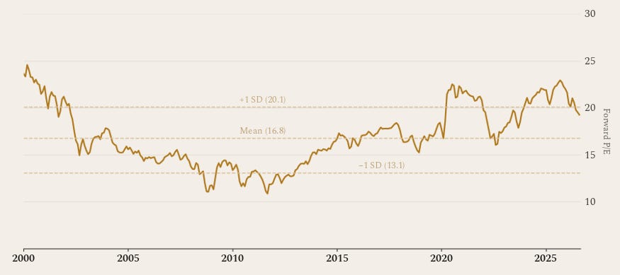
This implies that while valuations might be marginally more expensive than the average of the past couple of decades, they are both below the dotcom bubble and above recessionary periods – so perhaps fair. There is, additionally, another key piece of the puzzle. Earnings growth for the past couple of years has been extraordinary, largely driven by AI. Consensus year-over-year earnings growth of 28% is materially higher than the post-crisis expansion period (2010 to 2019) which averaged high single-digits. This growth rate is well above the historical average of 10%, meaning that a forward P/E less than one standard deviation above the average may even sound low in this context.
The second chart tells a very different story. The Wilshire 5000 to GDP ratio has averaged 121% since 2000, with each standard deviation being worth approximately 40 percentage points. During the dotcom bubble this metric peaked near 135%, reached a lower high around 105% prior to the Financial Crisis, and then fell to 54% in early 2009. Since then, it has climbed almost without pause to 236%. The only noticeable wobble since the start of its rise was during 2022 when interest rates rose sharply. The current value is a remarkable 2.9 standard deviations above the mean.
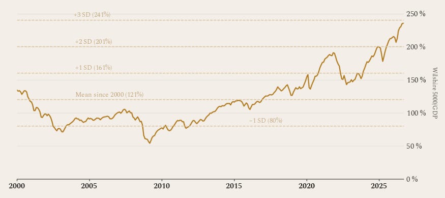
Looking at the above chart suggests an extreme overvaluation of the stock market. There are a couple of factors, however, that can allow such an extreme value above the mean yet be rationally justified. Firstly, there has been a shift from capital-intensive to asset-light business models. Businesses of the past were mainly in heavy industry, energy, financials and early telecom infrastructure, all of which required very large domestic capital expenditures. Today’s dominant market drivers, such as software and mega-cap tech, scale globally with much less marginal capital expenditure. This means that less additional input within the wider economy is required for the same economic output. Secondly, the US is increasingly becoming a ‘listing monopoly’ for global technology. Foreign capital flows directly to US-listed equities, inflating the total market capitalisation without having a corresponding impact on domestic GDP.
Roles reversed
An interesting comparison between these charts is that while the forward P/E ratio was showing the more extreme value (of the two metrics) during the dotcom bubble, it is now the Wilshire/GDP ratio which is most stretched. This can be justified by the structural changes in the market. Profit margins are currently double compared to the dotcom bubble, meaning the forward P/E can remain relatively low while the effective price-to-GDP much higher. The dotcom era also saw plenty of unprofitable or low-margin internet companies (such as Pets.com) whose price rises caused forward P/E ratios to surge while forward earnings estimated remained minimal.
Conclusion
When glancing at these valuation metrics, it is easy see a general divergence from the average and imply that a return to more ‘normal’ levels is due. When delving deeper, however, several structural changes (such as a shift from asset-rich to light, and US increasingly having a monopoly on listings, especially tech) have made it such that these metrics can deviate way above the mean and yet remain rational. Should these structural changes persist in the long run, then the averages could catch up to this new paradigm. This does, however, rely on earnings growth keeping up with the current pace and forward earnings projections not disappointing. If, for example, there were to be increased competition and/or reduced investment in AI (such as using bond issuance to fund data centres, expansion etc.) then earnings may well disappoint. Should this be the case, then a return to the mean would imply a drop of 15% from the forward P/E model (19.3 to 16.8, constant earnings) or a more staggering 48% based on the Wilshire/GDP ratio (236% to 121%, constant GDP). These are only back-of-the-envelope calculations, but clearly a drop of 20-30% is possible if earnings don’t deliver.
If you enjoyed this article and found it insightful, subscribe for free below.